Showing posts with label collecting colour. Show all posts

16 September 2013

Collecting Colours : Navy + Red


I've just returned from a couple of days at the Gold Coast at the amazing ProBlogger Training Event. I'm simultaneously exhausted and abuzz, and grateful for the chance to hang out with all the lovely bloggers and listen to all the intelligent, inspirational speakers. It really helped clarify a lot of things; what I want to do and where I want to take this blog. I'll share some of the golden nuggets I learnt over the next few weeks, but before I get ahead of myself and race in to the new, let's finish off the things we've started shall we? (Did I mention that most of my key learnings were around focus?...Shiny things! Squirrel!...What was I talking about? Oh yes, Collecting Colours.) 

I'm about a month behind at the moment but that's okay. Because life. August was supposed to be all about navy and red. And even though it's not really August anymore let's all just pretend for a moment, okay? (Side note - how great would it be if it was still August? Because it'd mean the year wasn't rushing past at quite the breakneck speed that it seems to be.). 

Navy and blue is another nautical pairing. It's kind of the more masculine version of blue and white. I don't mind this pair, but I don't love it. (I do like these photos though - they are chockfull of quintessentially Korean sights, which makes me happy!) I find blue and red a bit heavy, a bit staid, a bit old fashioned. Especially when it's used for interior design. And I don't have any of it in my wardrobe (but I don't mind it in my husband's wardrobe). How about you? Are you a fan of navy and red?

* * * * * * *

Every month through 2013 I'll be 'collecting colours', and you can join in too! Just create something, anything based on the colour pair for each month. Link up below, Instagram, Tweet and/or add your photo to the Flickr group here. You can go here to get all the information you need.  


31 July 2013

Collecting Colours : Yellow + Navy

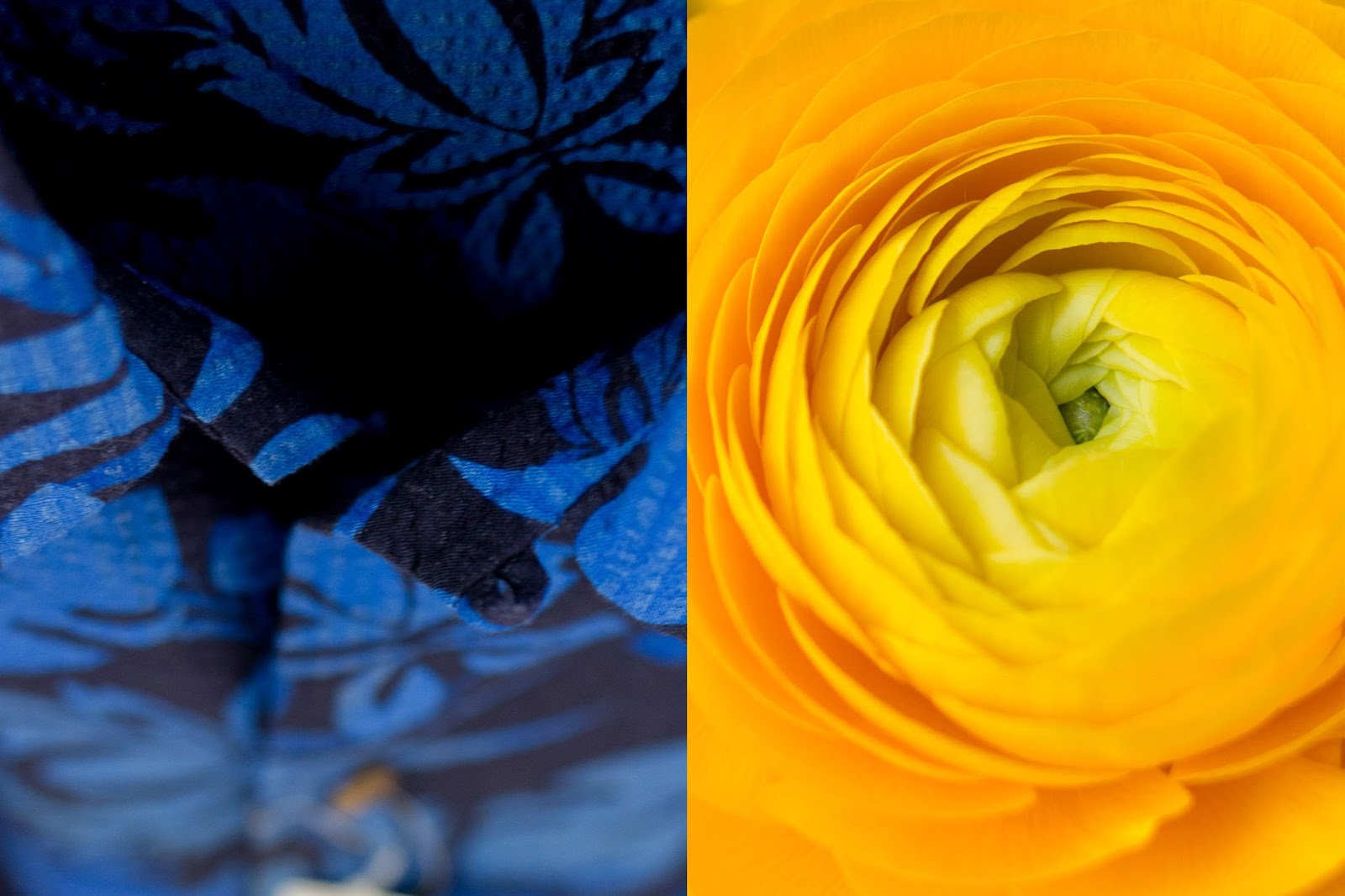
Well, I'm cutting this one just a little fine. But it's still July. For at least another four hours here in Seoul. Heaps of time really. I've been putting this one off because navy has proved rather painful to shoot. I found it tricky to find a lot of interesting navy out on the streets, and when I did find it it often looked either washed out or almost black in the final shot. But, with some dedicated eye-spying and a bit of Lightroom tweaking I got there in the end. 

Deep dark navy and bright yellow features heavily in some of my favourite colour schemes, like this one and this one and this one (all by Brandi Hussey). But you'll note in each of those palettes the pair is moderated by lighter shades of blue, or lots of grey, or a mustardy yellow. Like last months pair (pink and yellow), I also think these guys need a third, or fourth or even fifth colour to join the party for them really to sing. And I think they need to be out of balance; the yellow needs to step back and act as a highlight. 

So - whilst I'm not convinced that this months diptychs really work, I'm not writing this pair off just yet. My ideal bedroom is still all about deep navy blues (and lots of moody greys) with a little pop of yellow. And just look at how navy and yellow works in this lounge room - wonderful!

* * * * * * *

Every month through 2013 I'll be 'collecting colours', and you can join in too! Just create something, anything based on the colour pair for each month. Link up below, Instagram, Tweet and/or add your photo to the Flickr group here. You can go here to get all the information you need.  


22 June 2013

Collecting Colours : Pink + Yellow

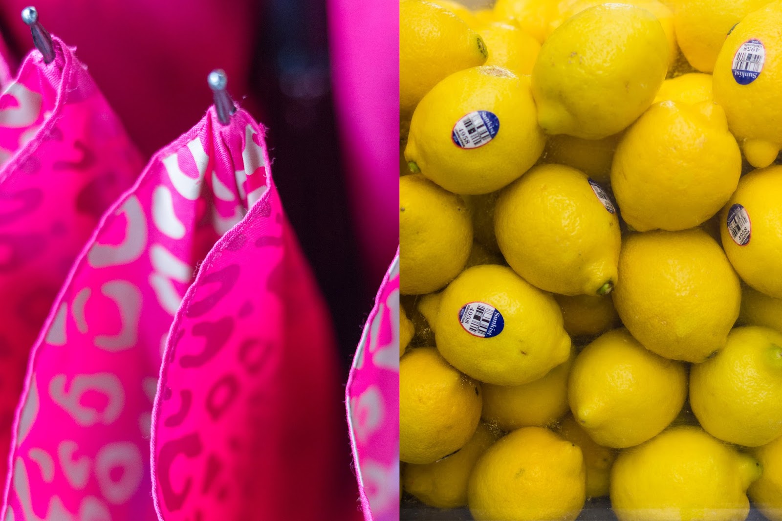
I have a feeling I picked this colour combination for reasons other than liking it, because I'm pretty sure I don't actually like it. But - I needed to fit yellow in to the monthly colour progression so here it is...

Whilst I love the vibrance and fun of last month's colour pair, there's something a little too...umm..sugary sweet? insipid? about pink and yellow together. I am not a fan. 

I think pink and yellow need a third colour, a modifier, to work. And then magic happens (generally modish, psychedelic magic!). Add a grassy green and you get something like this. Add an aqua blue (and a hint of navy) and you get this. Add orange and you get this. Even a dash of white changes things for the better (like this).

But, this challenge is about diptychs and colour pairs so unfortunately we'll have to do without. And please, do tell me if you think I'm wrong on this one...

* * * * * * *

Every month through 2013 I'll be 'collecting colours', and you can join in too! Just create something, anything based on the colour pair for each month. Link up below, Instagram, Tweet and/or add your photo to the Flickr group here. You can go here to get all the information you need.  


15 May 2013

Collecting Colours : Green + Pink


So fresh, so bright, so happy! Pink and green is all about sweetness and light and happy times yes? It seems to fit perfectly with the mood in Seoul right now. I'd forgotten how breathtakingly pretty the city can be when Spring hits. 

Around every corner there's stunning bursts of green, fresh new leaves; there's purple azaleas blooming en masse, and pots full of pansies and violas in a rainbow of colours. Add to that blue skies (when it's not smoggy...sigh), a warm breeze and the festivities surrounding Buddha's Birthday and it's a pretty magical time of year. I hope these diptychs capture just a little part of that.

Number two is my favourite, which one is yours?

* * * * * * *

Every month through 2013 I'll be 'collecting colours', and you can join in too! Just create something, anything based on the colour pair for each month. Link up below, Instagram, Tweet and/or add your photo to the Flickr group here. You can go here to get all the information you need.  


17 April 2013

Collecting Colours : Black + Green

Black and green should always be seen! There's something about the sombre seriousness of black pared with a splash of happy fresh green that does wonderful things for me! One of my favourite colour combinations... I adore a classic black polo shirt with a green stripe on the collar, or a LBD with thick black stockings and crazy bright green heels - a serious, polished look with just a hint of quirk. 

These diptychs featuring black have been quite the challenge, I'm rather pleased to be moving on to a new colour next month. I'm really pleased with the way the first and last one turned out. I like the repetition, the patterns. But I'm not such a fan of the middle two. It's an interesting process, figuring out what images work together. It's often not what I think will work when I'm first reviewing the individual images. 

ps. A few of you have got in touch to apologise for not getting involved in the challenge so far this year - please don't! Life is busy and there's so many things we all want to do. I'd love you to join in whenever and however you can. I can not stress this enough! I really want it to be a fun thing (challenging yes, but fun too!).

* * * * * * *

Every month through 2013 I'll be 'collecting colours', and you can join in too! Just create something, anything based on the colour pair for each month. Link up below, Instagram, Tweet and/or add your photo to the Flickr group here. You can go here to get all the information you need.  


13 March 2013

Collecting Colours : White + Black


How prescient of me to nominate black and white for this month! I mean it's always a classic combination but it's having a bit of a moment right now isn't it? I am so on the pulse, down with the cool kids, hip to the something-or-other. From here on in just call me Ms Fashionista. Yep.* 

So, white and black, black and white. Classic, classy, stylish...yet a little subversive too, when it's being graphic, bold, strong. And quite a challenge to capture. I love how these diptychs really bring the different textures to life. I guess once most of the colour of the world is gone that's what our eye is drawn to? I also like how abstract some of the photos are becoming. Can guess what all the different images are (especially that second pair)? I'll sent a postcard or two your way if you can! 

*If anyone ever reads my blog and fails to realise that I write with tongue firmly in cheek I'm going to come off as a bit of a wanker, aren't I?

* * * * * * *

Every month through 2013 I'll be 'collecting colours', and you can join in too! Just create something, anything based on the colour pair for each month. Link up below, Instagram, Tweet and/or add your photo to the Flickr group here. You can go here to get all the information you need.  


20 February 2013

Collecting Colours : Blue + White


Blue and white are a bit of a chameleon pair. Think of sky blue and white and it's all beach towels and boat houses and sunny Greek islands. But dial up the darkness on the blue a little and suddenly it's all oh la la - breton tops, berets and strolling the French riviera. And go darker still and it's all things nautical - yachts and sailors, brass buttons and the Royal Navy. Kind of impressive that one pairing of colours can evoke so many memories and cliches. I can't think of another that does, can you? 

ps. That top diptych is a sunny day in Tokyo paired with a snowy day in Seoul!

* * * * * * *

Every month through 2013 I'll be 'collecting colours', and you can join in too! Just create something, anything based on the colour pair for each month. Link up below, Instagram, Tweet and/or add your photo to the Flickr group here. You can go here to get all the information you need.  


01 February 2013

Collecting Colours : Orange + Blue

Oh dear lord! Finally! Getting this post up on the blog has been a bit like giving birth, but harder. (Yep, fairly obvious I've never actually given birth to an actual human being right?). I've been battling to do lists, travel (Japan! Hong Kong!) and my own stupidity...but hurrah! It's here! 

Orange and blue, how I love you! It is one of my long time favourite colour combinations, which is pretty much the reason why I picked it as the colour pair to kick off the year. I've never really figured out why I love it so much, but thanks to this post on Brandi's blog I now know that it's a complementary pair - they sit directly opposite each other on the colour wheel. And apparently paring them brings out the essential orangeness of orange and the essential blueness of blue. Intriguing.

All but one of the above photos was taken in Tokyo where I just spent three wonderful days (more on that later...). The first shot is from Hong Kong, in the wet markets near Central - one of my favourite places to be, especially with my camera.

ps. There is an orange and blue pom pom coming, soon...it's been a crazy start to the year!

* * * * * * *

Every month through 2013 I'll be 'collecting colours', and you can join in too!  Just create something, anything based on the colour pair for each month. Link up below, Instagram, Tweet and/or add your photo to the Flickr group here.  You can go here to get all the information you need.  


27 January 2013

Collecting Colours : 2013

Leave things to the last minute? No, of course not...there's still heaps of a few days left in January, right?* 

So..without further ado, here's my monthly project for 2013 - Collecting Colours. The sharp eyed amongst you will have noticed the extra 's' in the title - this year my collections are going to feature colour pairs (see the list below). This part of the project was very much inspired by Brandi's seriously awesome 'Color Theory 101' posts. 

Another difference to last year is that my collections are going to be 'virtual' - they will be photographic diptychs of appropriately coloured things rather than an actual, tangible collection of objects. I'm a bit sad about this as I really loved the process of hunting about the house and arranging all the stuff, but I do need something a bit more portable for 2013 so diptychs it is. This part of the project was definitely inspired by Louise Hawson's beautiful pairings throughout her 52 Suburbs Around The World project, click on over and have a look but fair warning - you may lose hours of your life in wanderlust.

Oh yes, and because 2013 is the year of the pom pom I'm also going to make a pom pom inspired by each colour pair, just for fun! Anyway, enough about me, here's some information for you if you want to play along (and I'd love it if you do!).

What is the Collecting Colours challenge? Each month you use the colour pairings as a jumping off point to curate a collection, real or virtual. You might collect objects from your environment (like I did last year), you might 'collect' photographs (like I'm doing this year), or you might even create a collection of watercolours, prints, granny squares... It's really up to you - the key thing is that whatever you create needs to feature just the colour pair nominated for each month.

What exactly do you mean by 'green'? Or 'red'? Or 'blue'? Well, that's really up to you. I've left the colour descriptions deliberately vague, as part of the challenge is figuring out what pairings work for you. For example, I always see pink and green as involving a soft pink and a light grassy green, but you might go for a super hot pink and a deeper green.

How do I share my collection? At some point during the month (hopefully towards the start!) I'll be doing a Collecting Colours blog post which will include a place to put your links (like this one).  January's post is clearly going to be a bit delayed, but I'll leave the link open for four weeks regardless of when I do the post.

You can also share your images in the Flickr group, or on Instagram, Twitter or Facebook - just mention me and/or #collectingcolours in the post so I get to see it!

Does it matter if I miss a month, or if I'm a bit late? No, of course not! Feel free to join in whenever and however you can.

Any questions? Leave a comment below or get in touch via email - jorpins_blog [at] yahoo.com.au


*One of the reasons for the delay in getting this on the blog was that I was determined to to the graphics in Photoshop (remember it's one of my 13 things in 2013?), and I did - hurrah!

11 December 2012

Twelve Months of Collecting Colour

Twelve months, done! Okay, so there where a few months where I cut it a bit fine but I still made it (in most time zones, anyway...). When I started this project one of the motivators was the idea of getting to the end and having twelve fun photos to play with. It's pretty great seeing them all together, a collection of collections.

If you'd like to have a look at all the Collecting Colour posts for 2012, you can find them here. And if you're interested in reading some more thoughts about the project you can have a look at this interview I did for Brandi Hussey's blog of awesome. I've so enjoyed this project - many thanks to each of you who looked, commented, and especially to those of you who played along. I am definitely keen to do something similar next year, so watch this space in January! 

Now that I've finished the twelve collections, I've been having a bit too much fun playing with various Collecting Colour collages. Look, it's a Collecting Colour colour 'wheel'! And look, it's a Collecting Colour rainbow! And some metallics, just for fun! So many possibilities, I could go on for days...

05 December 2012

Collecting Colour : December is Red

I am not a lady in red. I wore red once, to my Year 11 or 12 formal, and it was a mistake (oh dear lord it was a huge mistake). Other than that my wardrobe has been a distinctly red free zone. I don't wear red on my lips either, and it's only on very rare occasions you'll see it on my toes. If you can believe it I don't even own a single pair of red shoes (and I have quite the shoe collection!). 

But here's the thing, I sometimes wish I was a lady in red. One of those women who can rock long devil red nails, cherry patent leather pumps, a bright pout and a figure hugging frock. Red is seductive but powerful, sexy but smart. It makes me think of amazing, gorgeous ladies like Gwen Stefani, Annie Lennox, Scarlett Johansson and...Jessica Rabbit. One day, I will go out in red lipstick. One day. 

On the flip side red also makes me think of deliciousness - think summer berries, the perfectly ripe tomato, chillies, apples - all things red and tasty! Quite the complex colour red, isn't it? 

In this collection there is a tomato and some chillies, and there's also one of my most treasured possessions, a Luigi Colani elephant money box (this one); two paper punches (including one rather seasonal snow flake - it's snowing as I type this! Hurrah!); some ShapeMaker blocks; a tube of Lucas' paw paw ointment (I carry one with me wherever I go); lots of bits and pieces from our time in Hong Kong (a Year of the Rat ornament, funeral paper, double happiness paper cut...); an ace lego scorpion made by the eldest step son; an origami thing of awesome made by the youngest step son; a magnet from Paris (the hotel in Vegas, not the city); a dog toy in the shape of a candy cane which will be going under the tree for Ferdi in a few weeks; some toy cars, some books and a little container from Dinosaur Designs. 

The collection turned out a bit too messy for my control freak tastes, but I do love how vibrant it is!

* * * * * * *

Every month through 2012 I'll be 'collecting colour', and you can join in too!  Link up below, and/or add your photo to the Flickr group here.  And go here to get all the information you need.  


17 November 2012

Collecting Colour : November is Forest Green

Hmmm, November is forest green. Hardly rolls off the tongue does it? But I picked it because it's probably the only time of year that I do actually embrace forest green (pine trees! xmas ribbon! baubles! etcetera!) in any way. 

You see, outside of the odd splash in traditional xmas decor, forest green and I aren't friends. It seems kind of bland, kind of old fashioned (in a not good way), and - I'm pretty sure this is the biggest issue - it brings back memories of all kinds of monstrous school uniforms. Shudder. Are you a fan? Am I wrong? Do I need to get over this forest green related childhood trauma? 

Regardless, the collection was okay in the end. Rather small and not quite on colour, but okay (I especially like the actual forest green in there, and it smelt good too). In the collection are some lego army men (from Toy Story); a bobble head dachshund from the lovely ladies at made590; some wooden balls from a vintage molecular model (this one); a Korean zip bag which isn't really forest green but is very pretty, so...; a tiny tea cup, some books and some hair clips/ties.


* * * * * * *

Every month through 2012 I'll be 'collecting colour', and you can join in too!  Link up below, and/or add your photo to the Flickr group here.  And go here to get all the information you need.  


11 October 2012

Collecting Colour : October is Gold

First up, I adore the title of this post! It's Autumn here in Seoul, my favourite season, so for me October is gold! 

As for the collection, I was really dreading putting it together. I just don't have a heck of a lot of gold lying about the place. But - after raiding the craft cupboard, the dress ups box and the xmas decoration stash - I came up with something that I'm rather pleased with. I think the sparseness of the collection works with the gaudy brashness of the gold. What do you think?

In this collection are four xmas baubles; some lai see packets from our time in Hong Kong; lots of brooches and even more tiny confetti animals; a rather brash (and cheap) sequin belt and faux croc skin clutch that I bought some years back for a gold themed party; origami paper; a favourite little purse that I thrifted when I was a teen (that fabric!); some ink, hair clips and tinsel. Looking at it all now it's making me feel a bit festive actually! 

I'm really looking forward to seeing what you guys come up with for this one...


* * * * * * *

Every month through 2012 I'll be 'collecting colour', and you can join in too!  Link up below, and/or add your photo to the Flickr group here.  And go here to get all the information you need.